Tuesday, April 28, 2009


The way I am most comfortable working is slow, and methodical, paying great attention to detail. I can not help but be

influenced by what I believe to be the simplest yet most profound details in a photograph: the surrounding color and/or texture.

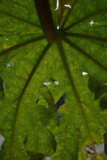
This series, focuses on these two stylistic details and looks at how the two impact one another, specifically on natural objects

and happened upon set ups. I am particularly drawn to natural objects and not interested in constructing a scene because I

hope to capture the charm and beauty that is often not recognized if not looked for, both outside and in my very own home.

To keep the focus on color and texture I use a shallow depth of field which allows my audience to both explore my surfaces

as well as not be distracted by potential background objects. Where ever I walk or pass by I can not help but take notice to

small bursts of color and texture combinations that exist all around us, but generally are not appreciated in the hustle of every

day life... I am naturally drawn to color and the surface qualities of objects around me. Even though this project specifically and

very directly portrays what I personally see in my surroundings I believe that it can speak to many as the images contain a surreal and dream-like quality that one can get lost in and create their own story and related to their own experiences.

Sunday, April 5, 2009


Although we may not have the same concluding intentions in our work, the artist i can most relate my way of approaching a piece of work from the book 'Photography as Contemporary Art' is Andreas Gursky:

Gursky works to create landscapes out of scenes such as grocery stores and tourist packed beaches.. he then produces his image is massive prints so that every hint at detail can be examined and appreciated by his audience. A very vital technique that Gursky uses is his inclusion of interesting and contrasting color and detail... here is where i draw a link between his work and mine: in my project color and detail is my sole focus. i am trying to stress the importance of these seemingly simple stylistic details and Gursky is a perfect example of how the proper use of these techniques can benefit a photo project (except his work employs this on a much larger scale and depth of field)

the more i research Gursky's work the more apparent it is that to him color and varying texture is of utmost importance to achieving his unified compositions. for example, in the first image above the pink body suits creates a playful contrast with the blue aprons worn by the factory workers... at the same time the rounded forms created by the body suits make and interesting contrast when compared to the very angular lines in the ceiling. the second image is an interesting play on color since the surrounding buildings are lacking any eye catching tones, and the central building is a mosaic of color...

even though Gursky and i do not have the same intentions with out final pieces, the process of creating a body of work and its potential success take similar routes..


Sunday, March 15, 2009

some more...

so i know i didnt print/present picture #2 but i decided to
include it on my blog because its one of the photos that i
still really liked, but somehow didnt fit quite right..

any thoughts??

PS. my theme is color & texture


Sunday, March 1, 2009

HELLEN VAN MEENE


The focus of Helen Van Meene's work is to capture a young girl at the point of reaching maturity, yet at the same time photographing them when their "attitude is still open, not really committed yet, still playful and open-minded... they are still themsleves"*.

"the photographs are not meant to be portraits... as a matter of fact i treat my models as objects which you can direct and guide... they are simply material for me"**.

1.
2.
3.
4.
5.
6.
7.
8.

9.
10.
11.
12.

what i enjoy most about Van Meene's work is that her images are beautiful and at the same time very eerie in their own respects... she shows young women in normal settings, but it is the way she places them and sets lighting on them that make them appear almost ghost like and lifeless..

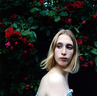
another way that Van Meene sets her subjects apart from the audience is by having the girls look to the side of the camera lens as apposed to straight on towards the viewer (creating a contact between the two)... this adds to their overall feeling of being disconnected and almost unhuman like. also the figures tend to have their body 'closed off' from the viewer.. what i mean by this is that in all the above figures there is a shoulder bent and coming slightly in front of the rest of the body and in effect disconnecting the body from the audience.. in image 11 where the girl is lying on the ground with squared out shoulders, Van Meene has placed the figure to the side of the frame which once again leads her away from the viewer making the image less personal.

a second technique that Van Meene utilizes to her advantage is choosing young women that are specifically very pale: once again this contributes to their ghost like and unnatural appearance. it also adds to their youth since their skin looks untouched by sun or any other harsh natural elements.

a seemingly small detail, yet profoundly important, is the use and placement of hair in each of the images, for example:
image 3- adds movement and the feeling of a gust of wind all around the figure
image 8- the way her hair falls over her face like a veil and around her neck is very restrictive
and adds an uncomfortable tension to a seemingly basic image
image 9- the way the hair waves up her curved back adds an interesting visual element in line
image 12- the pulled back hair adds to the harsh, reserved and restrained feel of the image

Van Meene usually places her subjects in bright light, and then lets the background fade into darkness.. this allows full attention to be placed on the girls.. almost like a frame. this allows an audience to fully focus on the most important part of her images: the youthful figure of a woman.

seeing images of her more recent work seems to back up how she has always been working: in a very delicate and labour intensive way of working, Van Meere fashions her images to achieve a very lifeless and deathly final print. the main difference i have noticed in her work is that she allows her images to have more of a background, although with equal attention paid to making sure they arent a distraction to her figures.


*,** Nihilsentimentalgia.com

websites:
http://hellenvanmeene.com/photos/
http://www.photonet.org.uk/index.php?pxid=172
http://www.rbge.org.uk/the-gardens/edinburgh/inverleith-house/archive/hellen-van-meene-japan-series

Book:
'Helen Van Meene: Portraits'
Publisher: Aperture; (October 30, 2004)
Text by Kate Bush

Article:
http://www.theskinny.co.uk/article/35965-helen-van-meene

Here is what ive recently been working on...


at this point ive decided to keep the trend going of having shallow depth of field (for the most part)and using complimentary colors to amplify certain colors


LESS IS MORE

the way i have been working is to try and keep my images fairly simple in composition so that the viewer can focus more on color and texture within the frame... here are some comparison shots that depict my point..