The focus of Helen Van Meene's work is to capture a young girl at the point of reaching maturity, yet at the same time photographing them when their "attitude is still open, not really committed yet, still playful and open-minded... they are still themsleves"*.
"the photographs are not meant to be portraits... as a matter of fact i treat my models as objects which you can direct and guide... they are simply material for me"**.
1.
2.
3.
4.
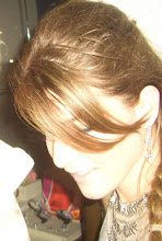
5.
6.
7.
8. 9.
10.
11.
12.
what i enjoy most about Van Meene's work is that her images are beautiful and at the same time very eerie in their own respects... she shows young women in normal settings, but it is the way she places them and sets lighting on them that make them appear almost ghost like and lifeless..
another way that Van Meene sets her subjects apart from the audience is by having the girls look to the side of the camera lens as apposed to straight on towards the viewer (creating a contact between the two)... this adds to their overall feeling of being disconnected and almost unhuman like. also the figures tend to have their body 'closed off' from the viewer.. what i mean by this is that in all the above figures there is a shoulder bent and coming slightly in front of the rest of the body and in effect disconnecting the body from the audience.. in image 11 where the girl is lying on the ground with squared out shoulders, Van Meene has placed the figure to the side of the frame which once again leads her away from the viewer making the image less personal.
a second technique that Van Meene utilizes to her advantage is choosing young women that are specifically very pale: once again this contributes to their ghost like and unnatural appearance. it also adds to their youth since their skin looks untouched by sun or any other harsh natural elements.
a seemingly small detail, yet profoundly important, is the use and placement of hair in each of the images, for example:
image 3- adds movement and the feeling of a gust of wind all around the figure
image 8- the way her hair falls over her face like a veil and around her neck is very restrictive
and adds an uncomfortable tension to a seemingly basic image
image 9- the way the hair waves up her curved back adds an interesting visual element in line
image 12- the pulled back hair adds to the harsh, reserved and restrained feel of the image
Van Meene usually places her subjects in bright light, and then lets the background fade into darkness.. this allows full attention to be placed on the girls.. almost like a frame. this allows an audience to fully focus on the most important part of her images: the youthful figure of a woman.
seeing images of her more recent work seems to back up how she has always been working: in a very delicate and labour intensive way of working, Van Meere fashions her images to achieve a very lifeless and deathly final print. the main difference i have noticed in her work is that she allows her images to have more of a background, although with equal attention paid to making sure they arent a distraction to her figures.
at this point ive decided to keep the trend going of having shallow depth of field (for the most part)and using complimentary colors to amplify certain colors
the way i have been working is to try and keep my images fairly simple in composition so that the viewer can focus more on color and texture within the frame... here are some comparison shots that depict my point..