Tuesday, April 28, 2009


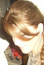
The way I am most comfortable working is slow, and methodical, paying great attention to detail. I can not help but be

influenced by what I believe to be the simplest yet most profound details in a photograph: the surrounding color and/or texture.

This series, focuses on these two stylistic details and looks at how the two impact one another, specifically on natural objects

and happened upon set ups. I am particularly drawn to natural objects and not interested in constructing a scene because I

hope to capture the charm and beauty that is often not recognized if not looked for, both outside and in my very own home.

To keep the focus on color and texture I use a shallow depth of field which allows my audience to both explore my surfaces

as well as not be distracted by potential background objects. Where ever I walk or pass by I can not help but take notice to

small bursts of color and texture combinations that exist all around us, but generally are not appreciated in the hustle of every

day life... I am naturally drawn to color and the surface qualities of objects around me. Even though this project specifically and

very directly portrays what I personally see in my surroundings I believe that it can speak to many as the images contain a surreal and dream-like quality that one can get lost in and create their own story and related to their own experiences.

Sunday, April 5, 2009


Although we may not have the same concluding intentions in our work, the artist i can most relate my way of approaching a piece of work from the book 'Photography as Contemporary Art' is Andreas Gursky:

Gursky works to create landscapes out of scenes such as grocery stores and tourist packed beaches.. he then produces his image is massive prints so that every hint at detail can be examined and appreciated by his audience. A very vital technique that Gursky uses is his inclusion of interesting and contrasting color and detail... here is where i draw a link between his work and mine: in my project color and detail is my sole focus. i am trying to stress the importance of these seemingly simple stylistic details and Gursky is a perfect example of how the proper use of these techniques can benefit a photo project (except his work employs this on a much larger scale and depth of field)

the more i research Gursky's work the more apparent it is that to him color and varying texture is of utmost importance to achieving his unified compositions. for example, in the first image above the pink body suits creates a playful contrast with the blue aprons worn by the factory workers... at the same time the rounded forms created by the body suits make and interesting contrast when compared to the very angular lines in the ceiling. the second image is an interesting play on color since the surrounding buildings are lacking any eye catching tones, and the central building is a mosaic of color...

even though Gursky and i do not have the same intentions with out final pieces, the process of creating a body of work and its potential success take similar routes..